People make rapid judgements, and on first sight of your landing page, it takes 0.05 seconds for a viewer to form an opinion.
Remember that saying about not judging a book by its cover?
Nobody listens to it when it comes to online store design.
This is important to remember because if you spend all of your time tightening the technical aspects of your site and making everything work behind the scenes, but your landing pages don’t catch the viewer’s attention immediately, you are wasting your time.
Since eCommerce websites have 0.05 seconds to make a good first impression, everything on your landing page has to be deliberate and planned.
That means:
- Fonts
- Colours
- White space
- Symmetry
- Pictures & video
and potentially most importantly – brief, impactful copywriting that immediately grabs the attention.
In this post, we aim to make this as easy as possible for you.
We will:
- Break down some of the research and statistics on first impressions and how to make an impact
- Give tips on the best eCommerce website design strategies and practices
- Show examples of the best-designed eCommerce sites to give you inspiration
By the end of this post, you’ll be better equipped to design a website that instantly grabs the viewers’ attention, leading to more conversions, more sales, and more profits!
Let’s start with some of the science:
Research Into the Best Retail Websites & How to Make a Great First Impression Online
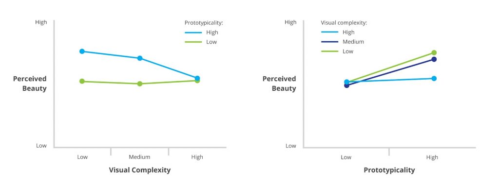
The above statistic regarding most opinions being formed within 0.05 seconds has also been confirmed by a separate study by Google’s AI blog.
In fact, they also suggested that it could often be even quicker.
While not directly related to eCommerce, there is also reliable research that has found that first impressions can never fully be undone.
Google’s study found that the following aspects were most important for making a positive first impression:
- Simple, clean and understandable visuals
- Appearing to clearly represent the category of website you fit into
In other words, don’t overcomplicate it, make it immediately clear what you’re offering, and don’t go so far out of the box that your fashion website (for example) no longer looks like a fashion site.
No matter how imaginative and revolutionary your new idea might be, people have expectations for what certain types of website look like, and moving away from that is a risk.
The video below from our friend and fellow marketer Eric Spellman provides some pointers about how the best eCommerce websites make a great first impression, and it is well worth a quick watch before continuing:
Where do Website Viewers Look First?
It takes a little longer than 0.05 seconds, but not by much, for viewers’ eyes to land on the specific part of your site that will most affect their judgement.
This takes around 2.6 seconds, according to Science Daily.
This study also tracked viewers’ eye movements to figure out which areas of the screen they scanned first. The results are signified by the numbers below:
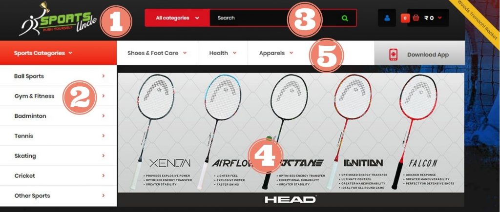
This is powerful information to know and we highly recommend prioritising these aspects of your site to make them look as appealing as you possibly can.
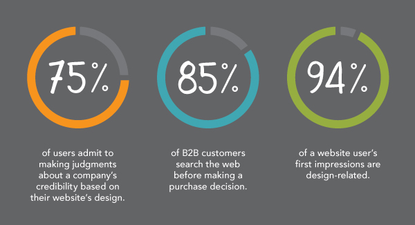
94% of First Impressions are Design-Related
Studies have found that of the first impressions potential customers have after viewing a web page, the design is responsible for 94%.
Based on the feedback given during this study, here are some major web page design elements to avoid:
- Too corporate and robotic feeling
- Unclear navigation or difficulty searching/sorting
- Too much text and not enough imagery
- Design is too complex or too busy
- Too much “introduction” not enough “getting to the point”
Keeping these in mind and keeping your design as clean and easy to understand as possible will help massively.
Out of all the feedback given above, visual design remained the most important, with people immediately forming a negative opinion and being unlikely to browse past the initial landing page, if a major design feature was unappealing to them.
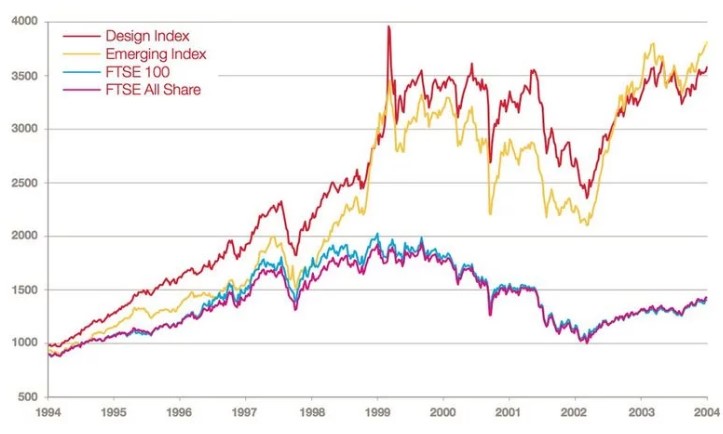
The below graph courtesy of the Design Council shows the comparison in the success achieved by companies that emphasise strong design (the red line) and the FTSE 100.
Yes, they outperform the FTSE 100 by 2x!
The second most important factor after visual design is navigation.
If it isn’t immediately obvious to a user how they should proceed, or how to go about finding a specific product they are interested in, they are more likely to bounce off your website and find another than they are to spend time exploring.
If there is one tip you take from this whole post, it should be to invest money and effort into visual design.
Beautiful eCommerce sites attract the attention, hold it, and are more likely to make sales, it really is that simple.
Bad First Impressions Hurt Your Customer Lifetime Value Too!
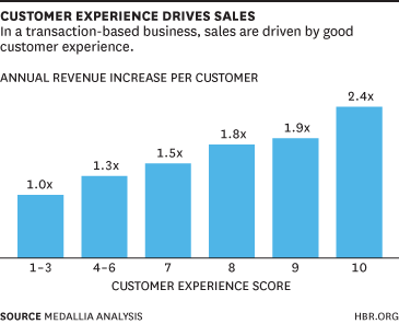
A boring, unattractive and overly businesslike website is something your customers will not enjoy using or be interested to explore further, which not only hurts your conversion rates and sales but long-term customer retention too!
The easiest way to think of this is that if a user gets a good first impression of your site, this increases the chances of them engaging with it in detail and becoming a part of your ecosystem.
They are then subject to your other customer retention techniques which will (in an ideal world) make them a fan of your site in the long term, and therefore more forgiving of any potential design issues or negatives they face on your site further down the line.
The same idea works in the opposite direction:
If their first impression of your site is negative, they will likely never give you a chance again.
If they do, it will likely be a pessimistic one, meaning your customer retention strategy is less likely to work for them.
So, What do the Best eCommerce Websites Do in Terms of Design?
Great eCommerce sites do often seem to follow certain rules.
You can learn a lot about “how to do it right” via these previous posts we’ve made:
- 10 eCommerce Business Examples to Learn From
- The 6 Best Product Storytelling Examples from Around the Web
Neither of these posts focuses specifically on visual design though, so here are some tips from some of the best eCommerce sites on how you can use powerful visuals to make a great first impression:
1: Make It Immediately Obvious What You Offer
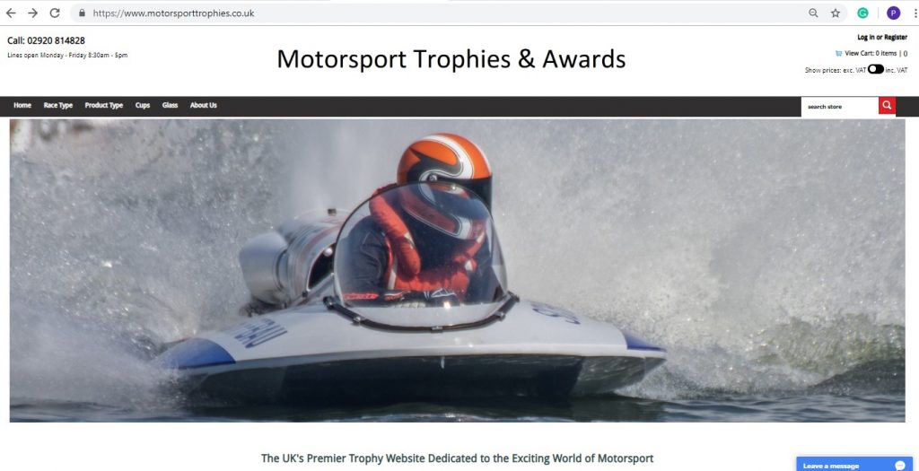
This point is often done via your copywriting and your images as opposed to the actual layout of your site, but it’s one of the most important things to get right.
If you read all of the above points, you’ll know that people online are essentially goldfish when it comes to their attention span and how long you have to make an impact.
If you sell clothing, have multiple pictures of products and a statement about what differentiates your clothes immediately visible on the homepage.
If you’re selling photography services, have lots of high-quality photos and a front-and-centre statement about why the photos you sell are better than any other.
Things like this may seem really obvious, but failing to do them can lead to confusion and abandonment pretty quickly.
2. Differentiate Yourself from the Competition!
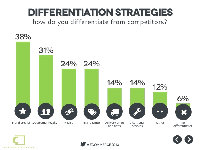
This may sound directly at odds with the first point, but it’s arguably just as important.
We all want to put across a different vibe and message to our competitors. If we don’t, why would viewers ever care to browse our website, never mind choose to purchase from us over the competition?
What does your website offer that’s unique? You should try to get this across in your fonts, images, text, even the colours you choose.
This is a fundamental part of both branding and product storytelling and helps your customers to recognise and identify with your brand in both the long term, and immediately on first viewing your website.
3. Make a Connection Between Your Brand & Inspiration (or Aspiration!)
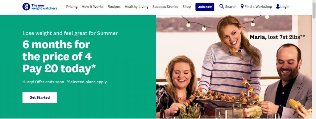
Inspiration sells.
The best eCommerce clothing sites sell the benefits of their clothing and the benefits of those benefits, using their website copy and photos of things like parties to talk about how your life, popularity and outlook can change by wearing their products.
The best travel websites often feature inspirational images of people relaxing on almost impossibly beautiful beaches surrounded by cocktails, waiters and equally beautiful people.
The best health product websites show photos of epic physical transformations and people in peak health.
This is not by chance, and inspirational quotes and photos can encourage your site users to think about how your products might just change their lives in the way your site suggests.
4. Prioritise “Above the Fold”
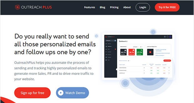
Given that we only have 0.05 seconds to grab the user’s attention, it’s a good idea to prioritise the parts of the page that are immediately visible without scrolling.
Attractive, clean and simple navigation menus, headers, logos can make it immediately more tempting to delve deeper and explore the site as a whole.
In fact, if you can manage it without making your site look too busy and complex, you should get everything you can into this section – drop-down menus listing your product categories, calls to action, discount codes, USPs, a search bar etc.
Each of these things is a potential chance to make a sale or at least to make somebody click further into your site, and if you can get away with it and still have a clean looking website, you shouldn’t miss out on any of them.
We hope these tips have helped you to make sense of how the best eCommerce sites 2019 and beyond will work to immediately grab the viewer’s attention and pull them through the conversion funnel.
We have assembled some of the best eCommerce website examples to hopefully give you some inspiration in how to achieve this, so let’s take a look:
The Best eCommerce Site Examples from Around the Web
We will provide screenshots of the “above-the-fold” sections of these sites, but it’s worth remembering that these are the cream of the crop and most will have plenty more tricks up their sleeve further down.
As a result, we will link to each of our picks for the best-designed eCommerce sites, and highly recommend you click through to browse the sites themselves in order to find inspiration for your own website:
Forever 21
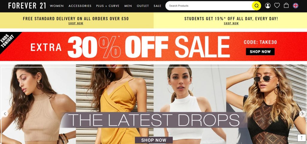
Without going into how their fantastic name gets across what they’re trying to do, differentiates them and is almost impossible to forget, all through 2 words, we’re sure you will notice how brilliantly effective this homepage is.
Forever 21 takes the tip about prioritising above-the-fold to heart. Let’s take a look at what they’ve managed to fit into such a small area without making it feel overcrowded:
- Dropdown menus for men, women, curves, sale etc, giving immediate and easy access to their entire catalogue
- Free delivery
- Easy and immediately obvious way to change the store country
- Search
- Discount code for students
- Huge sale banner with another discount code
- Huge banner for new product range with several attractive photos
It doesn’t get any less impressive when we scroll past the fold, with several more photos, product categories and calls to action appearing. It should come as no surprise that Forever 21 is one of the best fashion eCommerce sites for clothing when you see this!
Tata Cliq
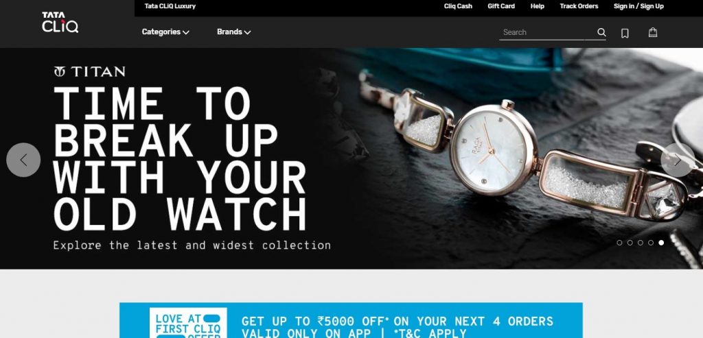
Tata Cliq is a huge success story and is considered one of the best eCommerce sites in India.
The site is extremely clean and professional looking compared to their competitors and scrolling down brings discounts, calls to action and USPs of every kind you can imagine.
Even we, browsing the site for research with no interest in buying anything found it very difficult not to click through some of their ads!
Pier 1
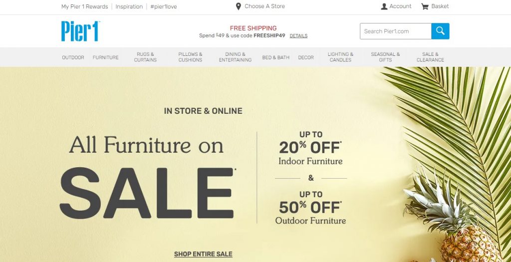
Another “above-the fold” masterpiece, Pier 1 is full of discounts, free shipping, stylish and elegant design, and even has an “Inspiration” link. Talk about ticking all the boxes!
We also like what they did with the bottom of the page.
Anyone who scrolls this far is likely at least slightly interested in their products, and they don’t leave you short of ways to continue engaging or to learn more about the brand:
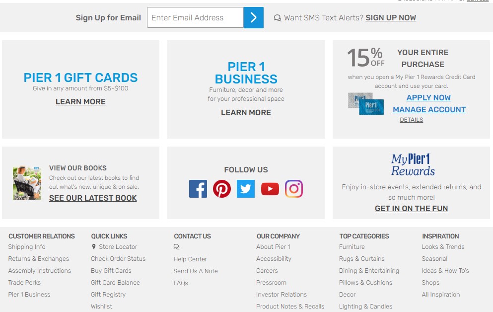
If your homepage just sort of….ends, consider taking a note out of Pier 1’s book and using that space to push engagement, just like they have in the image above.
Missguided
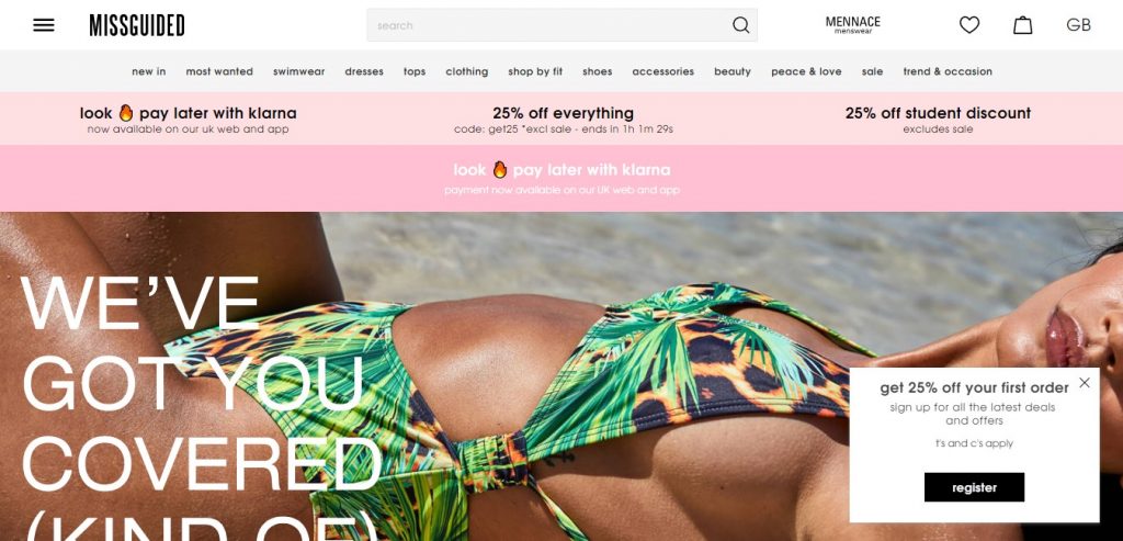
Missguided is one of the UK’s favourite eCommerce clothing sites, that has managed to develop a huge brand globally thanks to its incredible web design and frankly, pretty badass name.
They’ve got a bit of everything going on there, from the site categories along the top, to the even more in-depth menu on the hamburger icon, to student discounts, an awesome website design and stylish images, but our favourite techniques used by Missguided are:
- The sale call to action making use of urgency (ends in 1 hour!)
- Look fire pay later call to action – managing to say you’ll look amazing if you buy their products, and that it doesn’t matter if you can’t afford them right now, you should still order – all in 4 words.
- Playful copy – “we’ve got you covered, kinda”. Since it’s early June and the majority of customers are looking for clothes that are a little….less than they usually are, this is golden.
It’s also worth noting that Missguided is built in Magento. Magento, along with Shopify and WordPress, are probably the best eCommerce platforms for small businesses.
The fact Missguided are still using them and are able to create such a compelling site should tell you how good these platforms can be and how there is absolutely no need to spend a lot of money and time on custom developing your site.
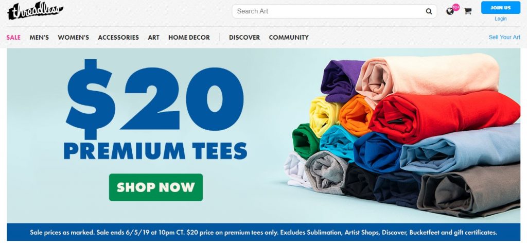
We aren’t going to keep going as in-depth on these as a lot of them use similar techniques, but the examples and inspirations just keep coming:
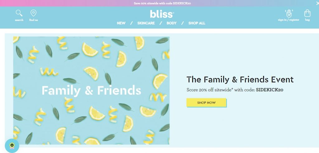
Bliss
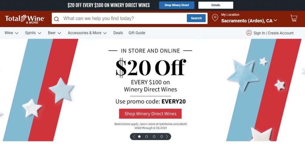
Total Wine
Threadless
Uncle Goose
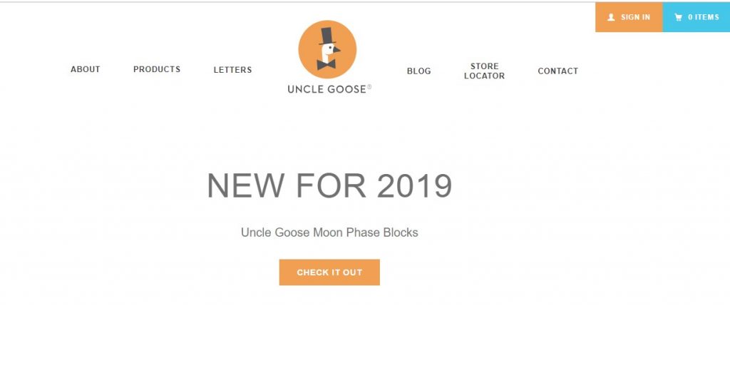
(Masterful use of white space!)
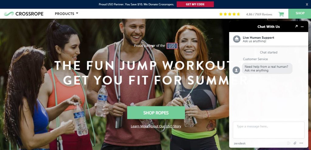
Crossrope
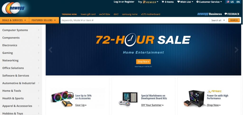
New Egg
Ella’s Kitchen
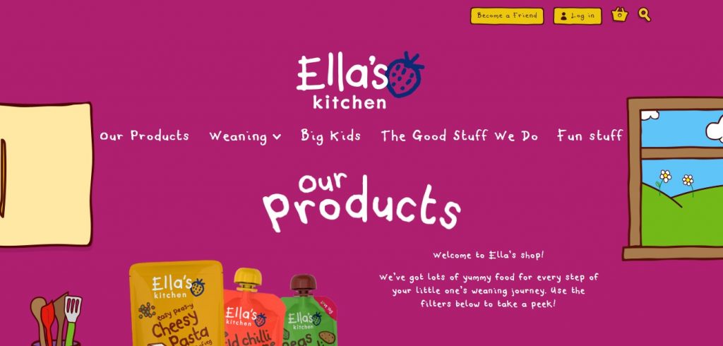
Ella’s Kitchen sells healthy food and snacks with low salt and sugar content, primarily for babies, toddlers and young children.
We really like how they’ve used a simple and colourful design based on children’s drawings to get this message across and appeal to parents.
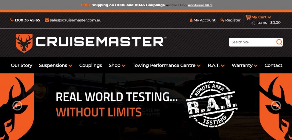
Cruise Master
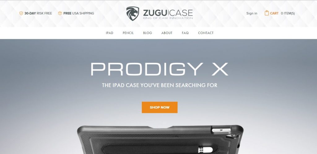
Zugu Case
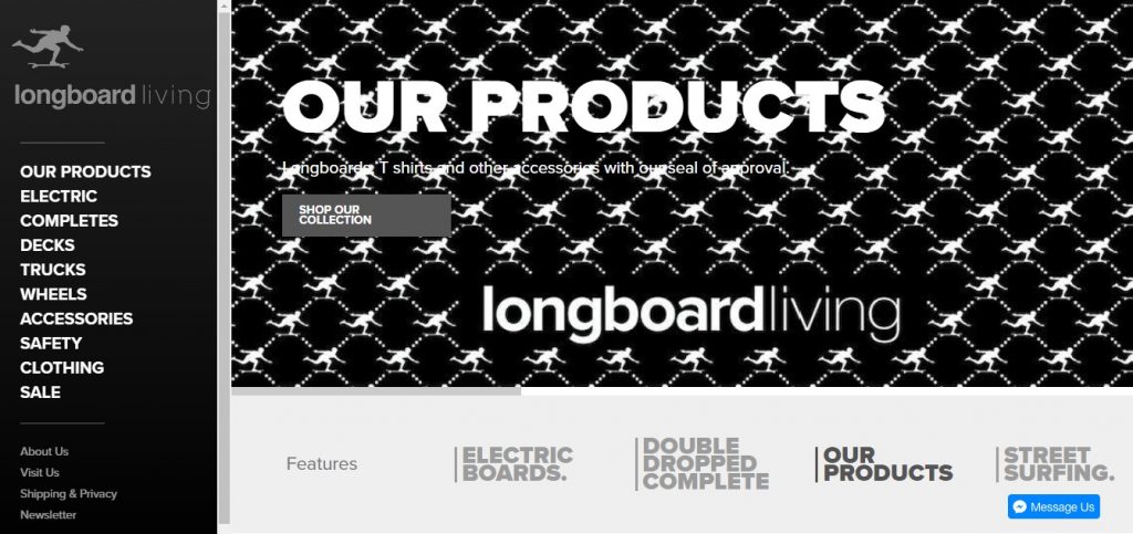
Longboard Living
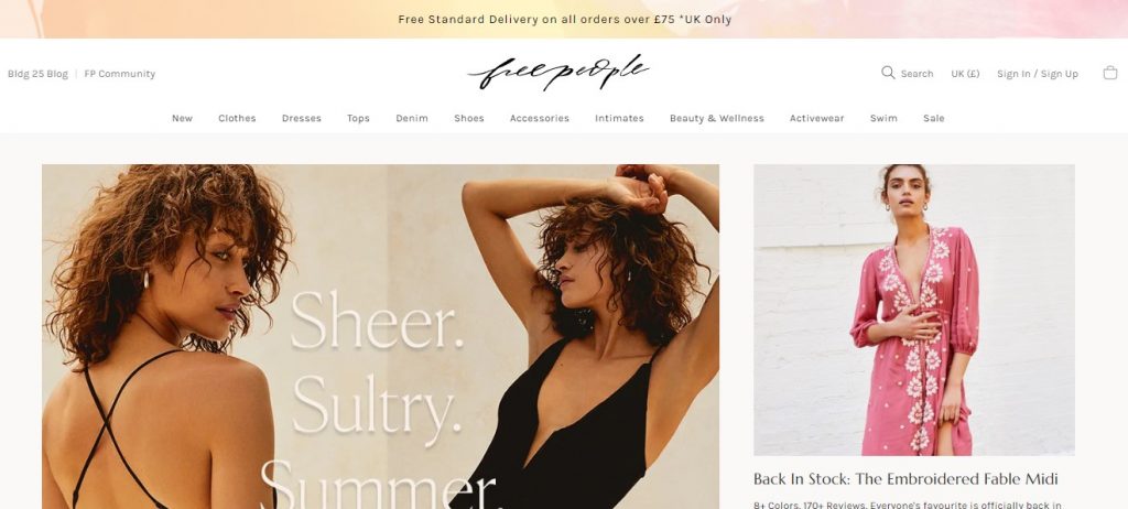
Free People
Thanks for joining us today.
If you clicked into each of the sites we listed, you are more than likely brimming with ideas and inspiration for your own eCommerce website design now.
Strong page design that converts is a mixture of science and art – you should use the techniques and features that have been proven to work by others but don’t copy them outright – find a way to do them your own way, in a way that fits your brand.
If you’re building your new eCommerce site or looking for ways to improve your existing one, we have some more resources that will be extremely helpful in getting more traffic, improving your conversion rates and profiting from it.
Here are just a few of the ones we recommend checking out next:
- 10 Examples of eCommerce Genius to Replicate & Learn From (2019)
- The Ultimate Guide to Getting Influencers to Promote Your Products!
- How to Write the Perfect eCommerce Product Description & Boost Sales!
- The 6 Best Product Storytelling Examples from Around the Web
- The Ultimate Strategy Guide for Cross-Channel Marketing in 2019
- How to Design a Product Page That Sells: Best Practices, Tips & Examples
- How to Calculate Your Repeat Purchase Ratio And Tips to Boost it!
- Work Out Your Customer Lifetime Value with Our Calculator & Formula!
- How to Build an Effective eCommerce Marketing Strategy – [Template]
- Products to Sell Online: Trending eCommerce Niches in 2019 & Beyond!
- The Definitive Guide to Professional Product Photography (On the Cheap)
- Personalised Marketing [Essential Tips]: Win and Keep Customers in 2019!
- eCommerce Conversion Strategies: 19 Power Moves for Huge Growth
- Customer Loyalty Programs: The Definitive Guide [Boost Orders in 2019!]
- eCommerce Conversion Rates in 2019: The Good, The Bad & The Ugly
- Persona Marketing: How to Create Personas for Your Online Business
- Breakdown of All eCommerce Business Model Types That Work Today!
- Ultimate Customer Service Guide for eCommerce in 2019 [6 Core Tips]
- eCommerce Buying Trends in 2019 & Beyond: Expert Guide to Staying Ahead
- Branding Your Business The Right Way: The Basics of Business Branding (Minus the BS Marketing Jargon)

