The landscape of the eCommerce industry is changing rapidly.
Mobile browsing is becoming so prevalent and ubiquitous that failing to take it into account when designing your product pages can kneecap your business from the start.
Amazon is also taking over so quickly that it is considered the number 1 place to buy and sell by many, beating even business’s own websites.
With all of this going on, the humble product page remains the most important part of your website and sales funnel.
Your product page is the window between your product and the rest of the world, the last piece of information your customer will see before they decide to buy (or don’t), and unlike your Amazon product listing, you have 100% control over it.
With that in mind, you’d be crazy not to put all your effort into optimising it as much as possible!
Do you know, for example, that eCommerce giant Overstock saw it’s organic traffic jump by 84% by optimising the product descriptions on the top 10% of its highest-converting pages?
A well-built product page based on best practices and actual data on people’s browsing habits is guaranteed to boost both your traffic and your conversion rates, transforming your business in the process.
In this article, we’ll break down some strategies used by some of the biggest online businesses in the world, while explaining how they work and how they could help to take your business to the next level.
For the sake of any beginners to eCommerce that may be reading, let’s take a look at the basics first:
What is a Product Page?
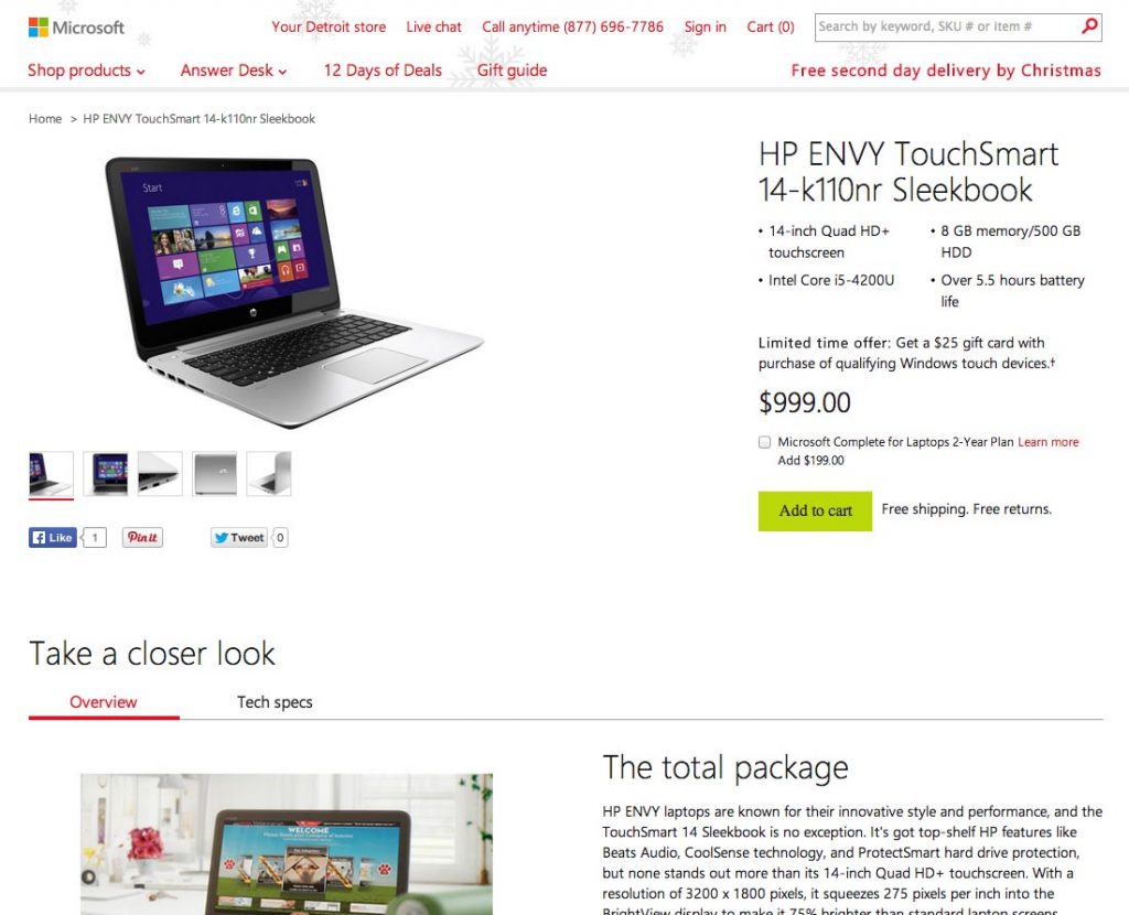
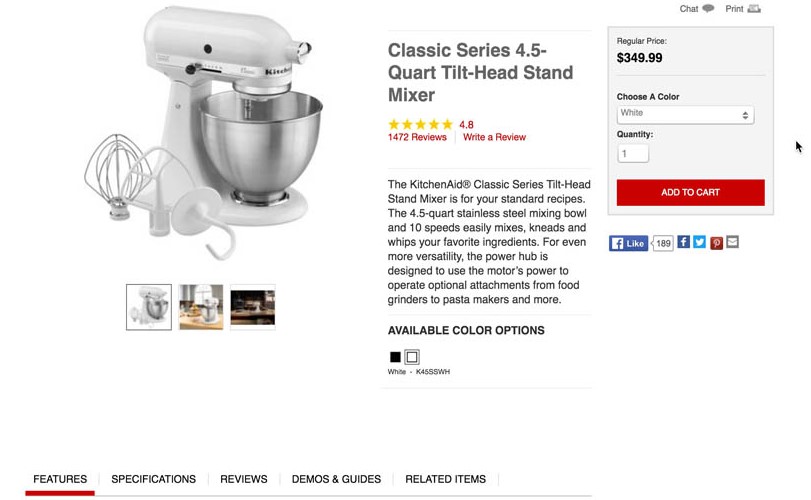
The name itself might be pretty self-explanatory, but a product page is one like the image shown above – essentially a page that is offering a specific product and using marketing and conversion techniques in an attempt to persuade users to buy that product.
Here are just a few of the things an effective product page should be able to do:
- Use high-quality photographs, an effectively written title and a detailed product description to instantly grab the reader’s attention and sell all of the features and benefits of the product
- Use copywriting techniques and psychological triggers throughout to push users towards the purchase
- Build trust in your company and/or the product where possible, usually through social proofs such as reviews but many other techniques exist
- Suggest related products, offer discounts for spending more than a specific amount, and utilise a variety of other techniques to increase the average order value
- Employ a variety of conversion techniques that are tested and improved over time
If you can do all of these, and most importantly continue to optimise over time, growth is unavoidable.
We have scoured some of the most effective product pages on the web, split tested our own product pages, and taken notes from the giants of eCommerce, allowing us to put together this list of best practices that are guaranteed to improve your conversions.
Let’s start with what the ideal product page needs:
What Makes A Perfect Product Page?
These are generally “best practices” and things you should be aware of.
The best product pages balance these best practices with the unique aspects of their businesses, choosing what will work for their audience, removing what won’t, and tweaking what could.
This means that knowing your target audience is the most important first step to building an effective product page.
Another excellent tip is to learn from the masters – Amazon is constantly working on removing friction from the buying process and making purchasing from them as attractive as possible. Since they are world leaders at this, you probably want to pay attention any time they make changes to their product page, cart or buying process.
With that said, there are a few surefire winning features that are almost always necessary regardless of your business or audience.
Let’s take a look:
Proven Product Page Best Practices
Before you start A/B testing your product pages, researching new strategies and their impact, and finding ways to constantly improve your conversions, you will need a strong foundation to begin from.
These are the absolute necessities that have been proven to boost sales in the majority of cases, no matter the product or audience:- A “human touch” such as a picture of an executive staff member or a live chat introduced by name and inviting customers to ask if they need any help
- High-quality product photos that show the product in realistic use situations and provide textual benefits and selling points
- An easily-scannable and adequately highlighted overview of the product – a customer should be able to immediately and easily access information such as price, features, options, and your main call to action without needing to read the whole page.
- A method of upselling and cross-selling, most commonly a “related products” or “popular products” section at the bottom of the page.
- Social proof of the product’s quality, such as reviews, star ratings, testimonials or quotes.
Before we delve into some more unusual or new conversion techniques, let’s take a look at each of these in more detail:
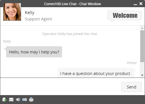
The “Human Touch”

Showing that your company is run by relatable humans who just want to provide the best service they can, can endear you to your potential customers and make them feel much more happy about dealing with you.
While telling the story of your business via your Home or About Us page is a great way to achieve this, you should also remember that plenty of potential buyers are coming from Google directly to your product pages.
As a result, they will often miss those pages entirely and an attempt to show this “human touch” on your product pages can go a long way.
A live chat window that displays your agent’s face and name, while also inviting users (by name, if they have an account) to message them if they need any help, works well here and is a great example of how personalised marketing techniques can make customers feel more confident dealing with your business.
Displaying face photos of you or your staff on product pages or similar is also a great idea and have been shown to increase conversions.
If you go this route; dress smart, smile, and try to arrange the image so that you’re looking towards the product. All of these techniques have been found to make you seem more professional and the product more enticing.
High-Quality Product Photos
If you want to go in-depth on techniques for taking product photos, no need to worry because that link will take you directly to a full guide on the topic.
This is more about optimally laying out those photos.
First things first, you want your main feature image.
This should be the largest and most eye-catching thing on the page, show your product in full and be the best possible quality.
It’s worth remembering that more than 70% of customers would prefer to shop in person at a physical store. The main reason for this is that it affords them the ability to view the product’s quality in person, ask questions and potentially even feel it.
In fact, the inability to try out a product before buying is the second most disliked aspect of shopping online, according to the below graphic from BigCommerce:
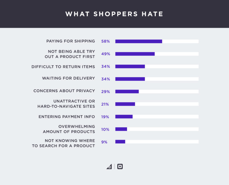
The higher the quality of your feature image, the further you have gone towards mitigating this and convincing your customer of the product’s quality – something that could well convert the 49% of people that voted for that option.
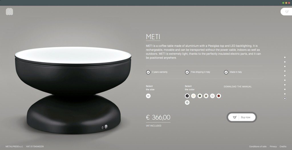
Outside of your main feature image, the next priority is a gallery of equally high-quality photos.
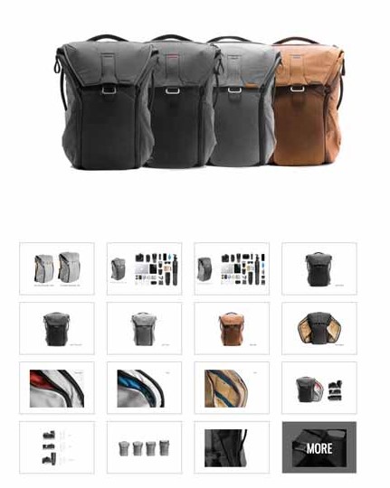
These should display everything your main featured image doesn’t, such as close-ups of specific features, details and images of the product from different angles.
You can even add a product video at this point, or a 360-degree animation.
The ideal layout is one that doesn’t interfere with the feature image or the rest of the page, but is still immediately clear and offers customers a chance to explore the product more like shown in the example above.
The optimum number of photos depends on your product, but 6-12 is a good rough guide to aim for – the main aim of your gallery is to answer any and all questions the customer might have after seeing the main image, e.g, “what does the back look like?“, or “what about the label?” in the case of clothes, or “what sockets are on the bottom?” in the case of a device.
Last but not least, your product images will likely have a fair bit of blank space and empty background.
Since you know your potential customers will be scrolling through these images looking for more information, do not waste this space.
Add text to these empty spaces detailing the benefits of the features being shown in each image, as well as the benefits of those benefits.
This lets the customer take in more potential reasons they should make the order while scrolling through the photos, increasing the chance of a purchase.
Upselling and Cross-Selling
A “suggested products” or “related products” section is key on any modern eCommerce website.
It needs to be large and relevant enough to draw the attention but also tucked away enough not to distract too much from the main product, for example:
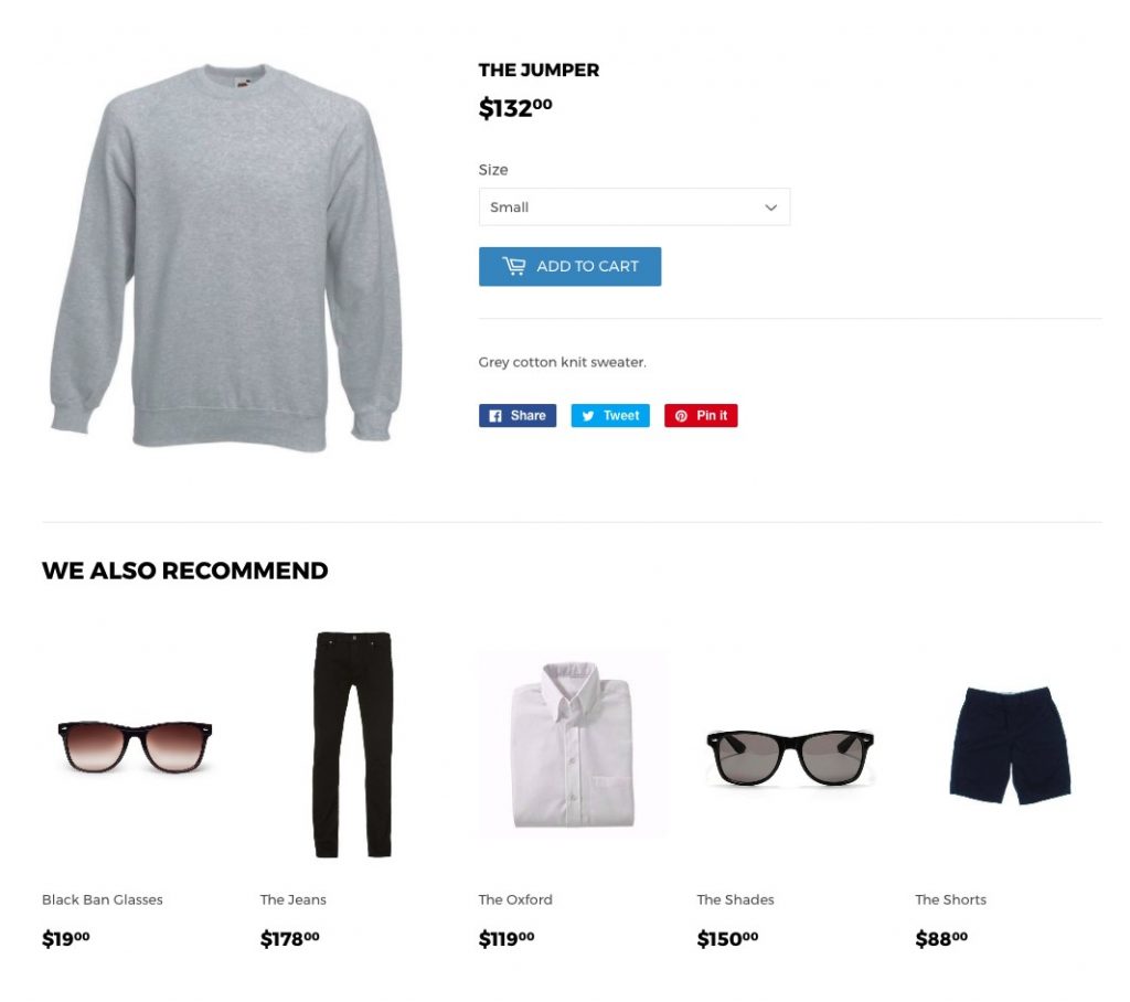
This simple strategy can improve your conversions and your average order value. This works in two ways:
- If a customer lands on your product page and it isn’t quite what they wanted, a “related products” tab gives you a second chance to offer a similar product to them and prevent them bouncing off your site
- If they do go ahead and purchase, this section can also be used to offer complementary products that go well with the main product, for example, extra coffee sachets with a coffee machine.
You can collect data on shoppers’ habits and use A/B testing to improve the effectiveness of this over time, suggesting products that are commonly bought with or after viewing your main product.
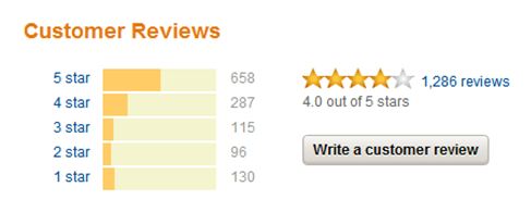
Social Proof
This takes it back to the “trust” issue.
People are less trusting of eCommerce sites than they are of brick-and-mortar stores, even in cases where there is no good reason (which may be the majority of cases in 2019).
Social proof such as reviews left by previous buyers goes a long way to winning back this trust, and since more trust means more conversions, you need to take notice.

User generated reviews often seem more “genuine” than testimonials or quotes since they are much more difficult to simply fake and they (hopefully) provide a variety of different viewpoints from people with different desires and outlooks on the product.
This is another effect of Amazon’s world domination – customers are used to seeing reviews there, so now feel less comfortable than ever shopping on sites that don’t provide them.
That’s it for the “best practices” we listed above but there are some more general tips to take into account too:
Avoid Clutter
When taking all of the above tips into account, it can be easy to make your page cluttered and too packed for your customers to even make sense of it. You need to be aware of this and lay things out as clearly as possible.
You also want to use white space as much as possible, as it helps to encourage users to focus where you want them to – your awesome product descriptions and mindblowing product photographs, for example.
If you’re stuck for ideas on how to lay stuff out, don’t be afraid to look at some of the most popular online stores for inspiration – after all, you can be sure they’ve spent a lot more on research and split testing than you ever could at this early stage.
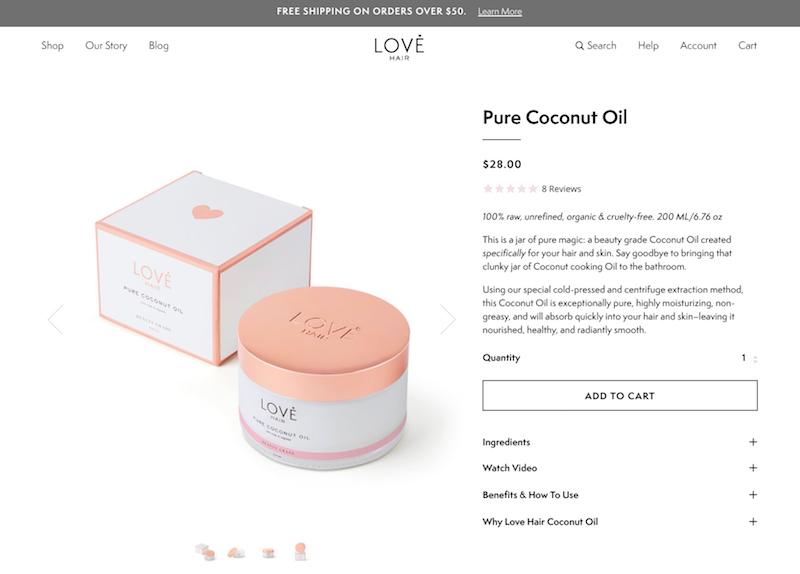
Clear Calls to Action
We’ve gone through this so many times in our eCommerce marketing guides that you’re probably screaming at us to shut up right now, but its importance cannot be overestimated.
After your feature image, your “Add to Cart” or “Buy” button should be by far the most obvious thing on the page.
The last thing you want is to sell somebody on your product using all of the tips listed here, then lose them at the last hurdle because they aren’t sure how to purchase!
The below is an excellent example of an effective buy button – the button is clear, obvious and stands out, and is surrounded by selling points – a discount, free delivery, the urgency of knowing somebody else is buying one right now, and the ability to add it to your wishlist if you don’t have your card to hand right now, giving the store a chance to remind you later.
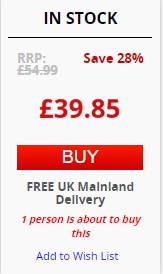
Every single one of those pieces of information is another potential chance to convert, and all of that is done while taking almost nothing away from the surrounding page or without cluttering things up.
We hope this guide has given you some food for thought in regards to your product pages.
We have a wide variety of detailed guides to help you boost your traffic, conversions, and ultimately profits, so next why not take a look at one of these?:
- How to Calculate and Boost Your Repeat Order Ratio
- How to Work Out Your Customer Lifetime Value
- How to Conduct In-Depth Product Research
- How to Build an Effective eCommerce Marketing Strategy
- Trending eCommerce Products for 2019
- Powerful Conversion Strategies
Once you’ve had a look at some of those, it’s time to start putting your new knowledge into action!
Remember to keep both eyes on AmazonSEOConsultant as we bring you more regular easy-to-follow guides based on strategies from the big boys, and if you’d rather our help building your product pages – consider filling in our proposal form!